What is User Experience (UX)?
- UX is the quality of experience a person has when interacting with a specific design
- Ranges from small artifacts (a cup, toy, website, app) to large integrated experiences (museum, airport)
- UX is how users feel when using a product — whether they like or dislike using it
- Determines if they will use it again (users always have alternative choices)
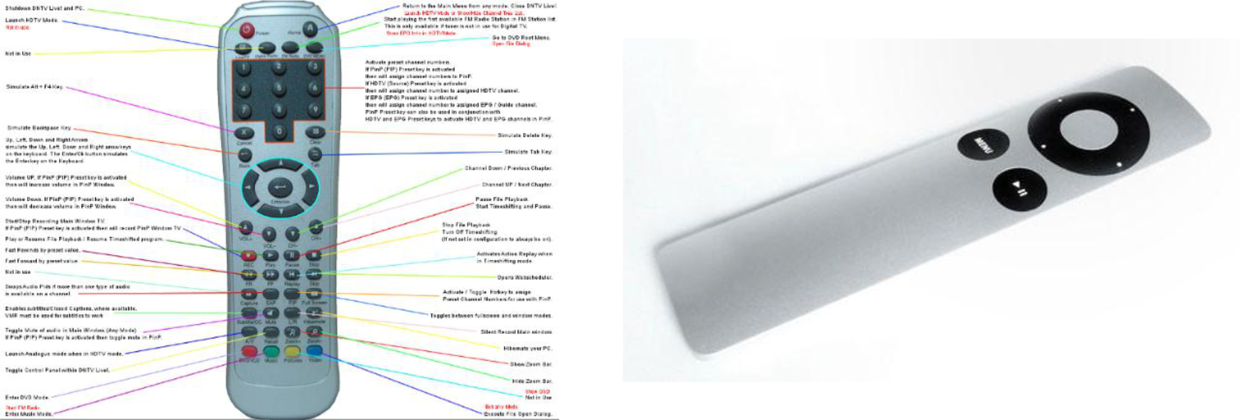
Think of a ketchup bottle: The old upright bottle (UI) looks familiar, but the squeezable upside-down bottle (UX) is actually easier to use — same product, better experience.
Common Sense vs. Information Architecture vs. User Experience
| Level | What it does |
|---|---|
| Common Sense | Groups things into basic categories (forks, knives, spoons) |
| Information Architecture | Labels and names each item precisely (dessert fork, butter knife, soup spoon…) |
| User Experience | Arranges everything into a proper dinner setup so the user knows exactly what to use and when |
Like setting a dinner table: UX isn't just organizing cutlery — it's putting everything in the right place so guests don't have to think.
User Experience Design (UXD)
- UXD is the process of enhancing user satisfaction by improving the usability, accessibility, and pleasure of the interaction between user and product
- Goal: design a product users can use not only with success but with pleasure — and one they want to use again
"It doesn't matter if you used a device a hundred times successfully — you will remember the unsuccessful attempt." — Donald Norman
What Do You Want Your Audience To Do?
| Goal | Means |
|---|---|
| Useful | Have a reason/value to use it |
| Usable | Be able to complete tasks |
| Desirable | Enjoy themselves while using it |
| Findable | Navigate and find content easily |
| Creditable | Trust you |
| Accessible | Be able to use it regardless of ability |
| → Return | Come back again |
User Interface (UI)
- UI is the interface that users interact with — a meeting plane of user needs and product features
- When users see an interface, they form a conceptual model — they imagine how the product works and what actions to take
- Designers must investigate user needs and apply findings to the design
- Designers are responsible not only for how the product looks but how users interact with it
"A picture is worth a thousand words. An interface is worth a thousand pictures." — Ben Shneiderman
UX vs. UI Design
| UX Design (UXD) | UI Design (UID) | |
|---|---|---|
| Focus | Quality of the overall experience | Visual and interactive elements |
| Goal | Enhance satisfaction, loyalty, ease of use | Make interaction simple and efficient |
| Includes | Interaction design, info architecture, wireframes, user research, scenarios, personas | Visual design, colors, layouts, typography, branding, graphic design |
| Scope | The whole system | The interface layer |
UX is like the blueprint and floor plan of a house; UI is the interior design and decoration.
The 5 Layers of UX (Jesse James Garrett Model)
(Image-only slide — see lecture diagram)
Bottom → Top, Abstract → Concrete:
- User Needs / Site Objectives ← Foundation
- Functional Specifications / Content Requirements
- Interaction Design / Information Architecture
- Interface Design / Navigation Design / Information Design
- Visual Design ← Most concrete/visible
Misconceptions About UXD
1. UXD ≠ UI Design
- UX is the design of whole systems and their interconnections, not just a layer or component
2. UXD ≠ A Step in the Process
- UX isn't a checkbox; it must be integrated into everything you do
3. UXD ≠ Just About Technology
- UX is any interaction with any product, artifact, or system — it doesn't even need a screen
4. UXD ≠ Just About Usability
- Usability matters, but UX also includes learnability, and visceral/behavioral/emotional responses
5. UXD ≠ Just About the User
- Business objectives must be met too
- Designing to collect user data (interests, behavior) → prediction/recommendation models
- Designing to maximize time spent on app → more profit
6. UXD ≠ Role of One Person/Department
- UX is everyone's responsibility across the whole organization
7. UXD ≠ A Single Discipline
- Requires people from multiple disciplines (design, engineering, psychology, business…)
8. UXD ≠ A Choice
- Companies that don't invest in UX won't survive — experiences happen whether or not you plan them; unplanned = likely poor
What UXD Actually IS
| Misconception | Reality |
|---|---|
| UI design | The system |
| A step | The process |
| About technology | About behavior |
| About usability | About value |
| About the user | About context and business |
| One department | Organizational culture |
| One discipline | A collaboration |
| A choice | A means of survival |
Experience Building Blocks
(See lecture diagram — "house" model)
Foundation: Users (emotional & rational wants/needs) + Business (measurable goals) + Brand (core values)
| Building Block | Key Questions |
|---|---|
| Useful | Is there a reason to use this? Does it serve a purpose? Does it satisfy needs? |
| Useable | Is it intuitive? Easy to use? Accessible? |
| Desirable | Is it aesthetically pleasing? Differentiated? Memorable? |
| Sustainable | Can it be maintained? Can it evolve? Can it scale? |
| Social | Does it facilitate conversation? Support sharing? Encourage community? |
→ Together these build Great Customer Experience
UX Design Process
(Image-only slide — see lecture diagrams for "new product" and "improving existing product" flows)
For New Products
- Define: Initial project scope and objectives
- Learn: Research user needs → Create personas/use scenarios → Refine content & functionality
- Generate: User flow maps, IA, wireframing, prototyping → Graphic UI → Prototyping
- Supply: Front-end, UI & visual design, documentation, style guides, CSS, code
- Loops back through: user interviews, user observations, testing & feedback, A/B testing
For Existing Products
- Input: Existing data, user profiles & feedback, analytics, issues
- Learn: Analyze current usability → Update use cases/personas → Update content/functionality
- Generate: Improve IA & interactivity, partial wireframing → Improve graphic UI, prototyping
- Loops back through: user feedback, contextual inquiries, multi-testing
The Psychology in UX Design
UX sits at the intersection of:
- Psychology — the way it makes you feel
- Science — the way it works
- Art — the way it looks
Key Cognitive Areas in UX:
- Attention
- Memory
- Language
- Problem Solving
- Decision Making
- Reasoning
#1 — Cognitive Attention
- Attentional process is divided into two types:
- Bottom-up (Stimulus-driven): stimuli come to notice unexpectedly (e.g., a flashing notification)
- Top-down (Goal-directed): you are actively looking for something (e.g., searching for a button)
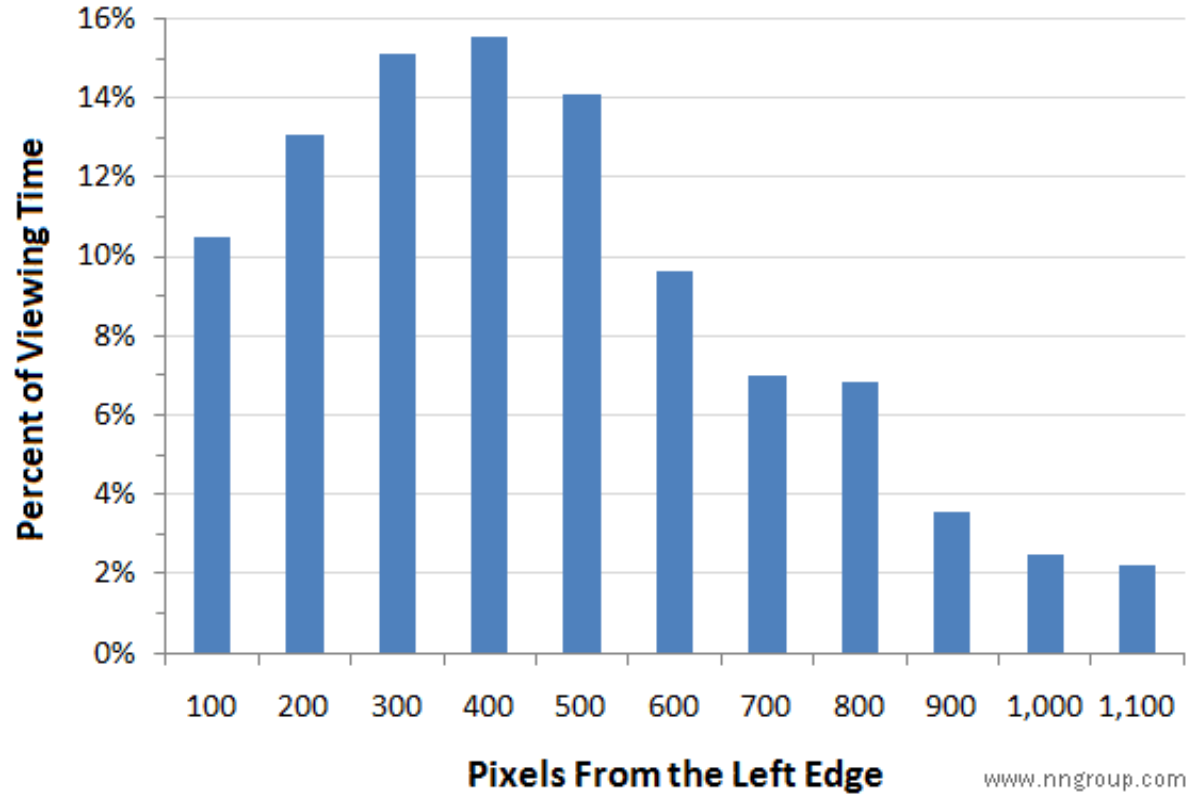
- Research finding: People spend more than twice as much time looking at the left side of a page than the right
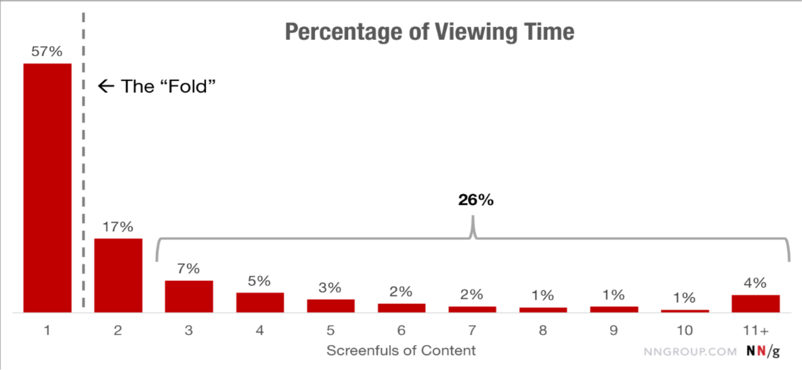
- Content above the fold gets dramatically more attention (57% of viewing time on screen 1, dropping sharply afterward)
Like reading — we naturally start from the top-left. Place the most important content where eyes land first.
#2 — Cognitive Memory
Von Restorff Effect
- Items that stand out from their surroundings are more likely to be remembered
- Applications in UI:
- Notification badges (red dot on app icons)
- Highlighted recommended pricing tier
- Prominent CTAs like "Buy It Now" in a contrasting color
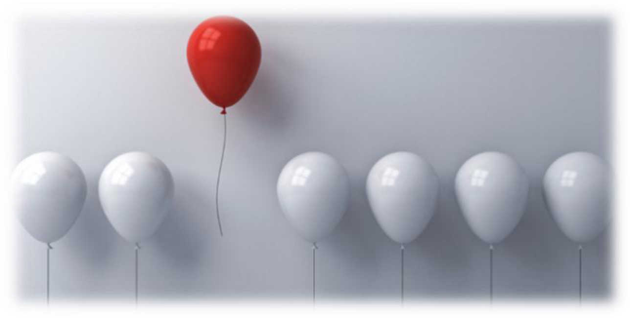
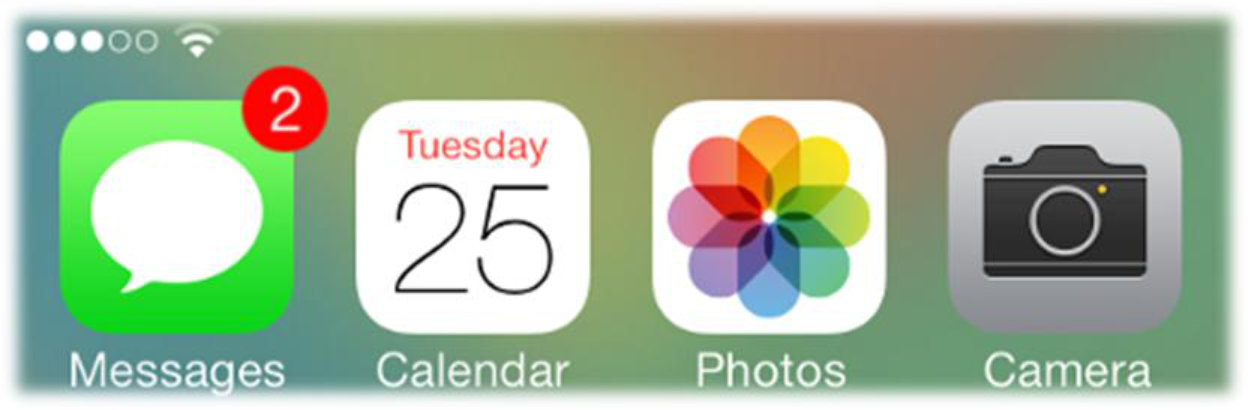
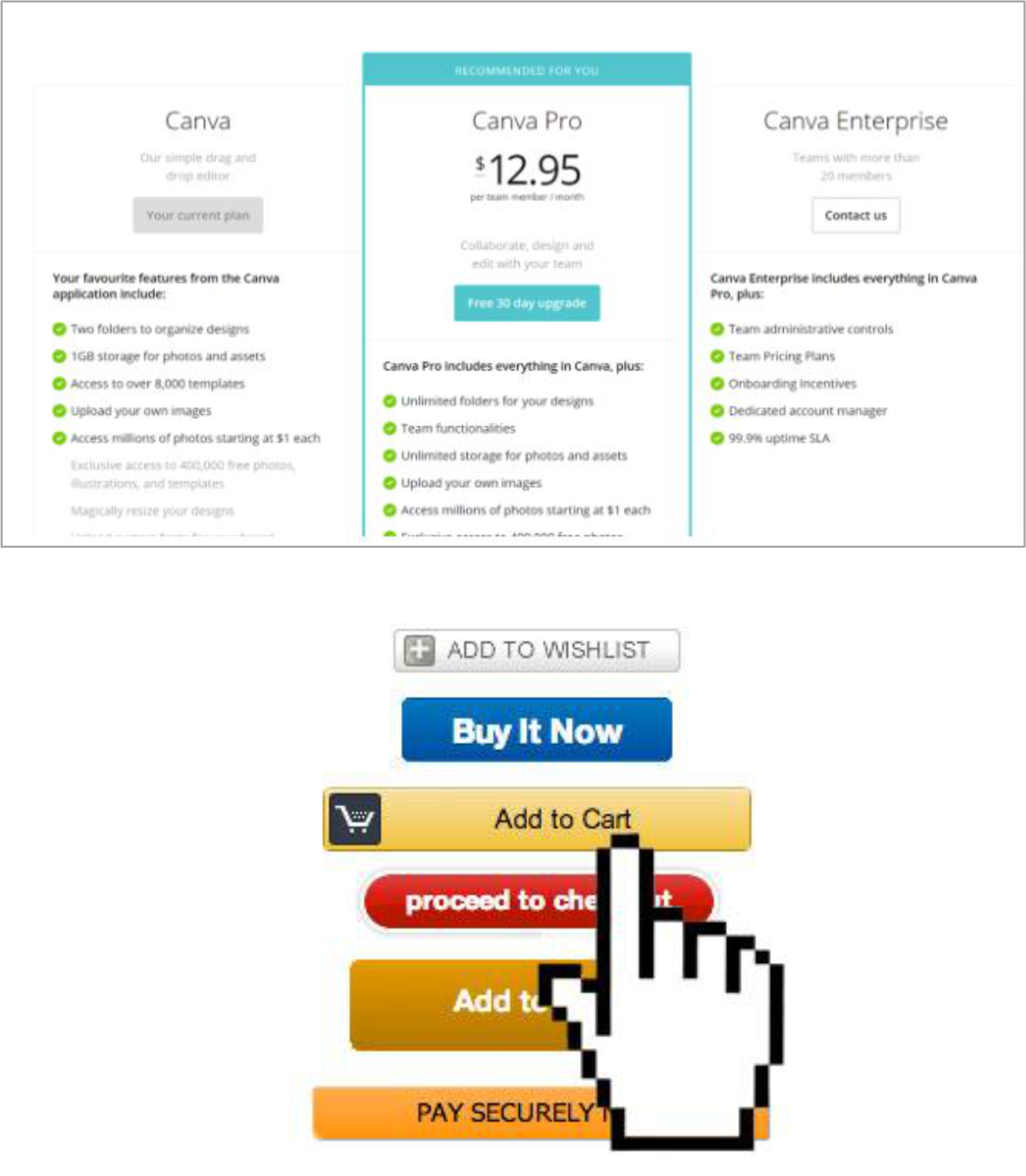
Like one red balloon among white ones — it's immediately memorable.
Serial Position Effect
- Users best remember the first and last items in a series
- Primacy Effect: First things are most important — they influence what comes next
- Recency Effect: Last things are remembered — most accurate representation of "now"
- Design implication: Place the most important items at the beginning and end; least important in the middle
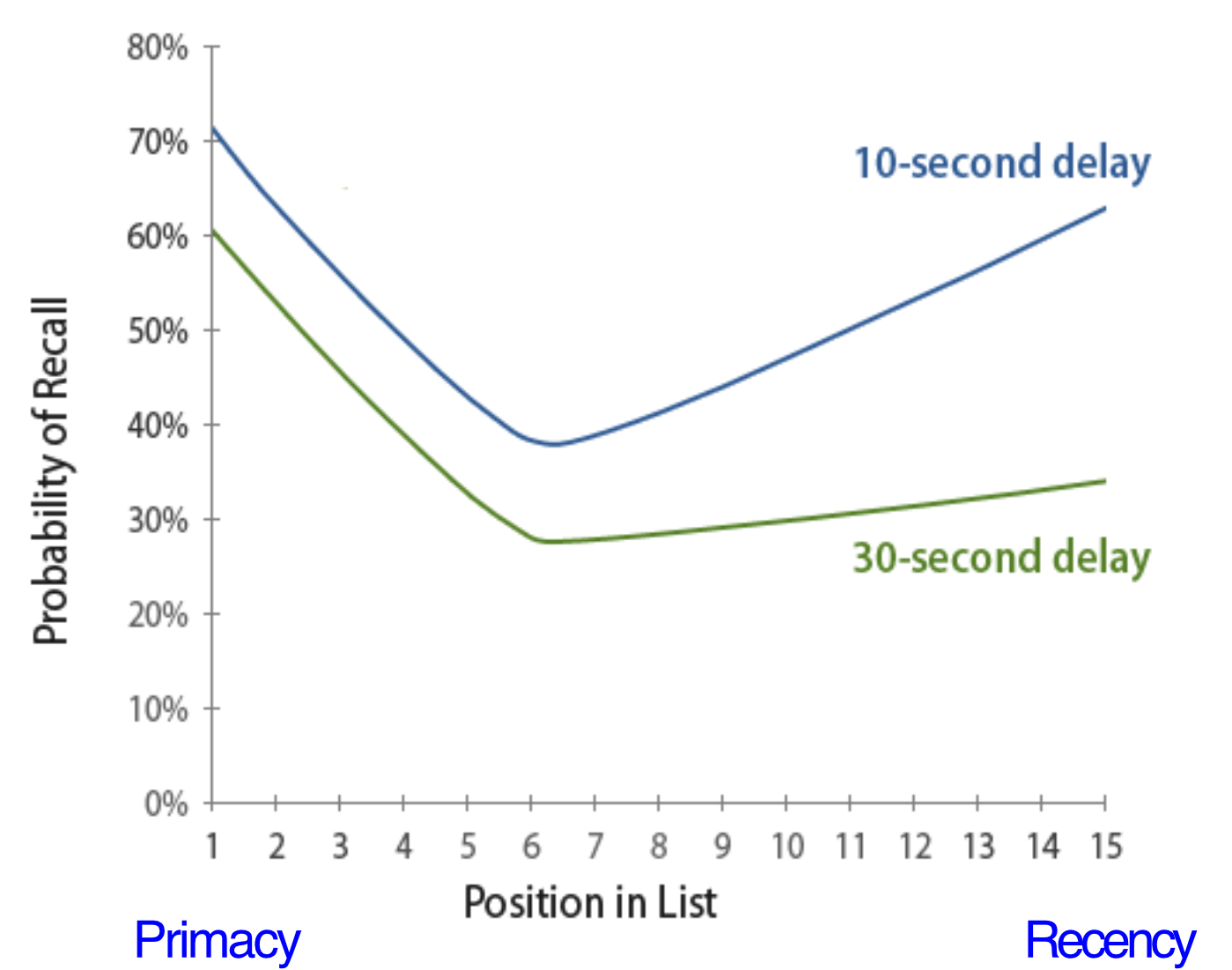
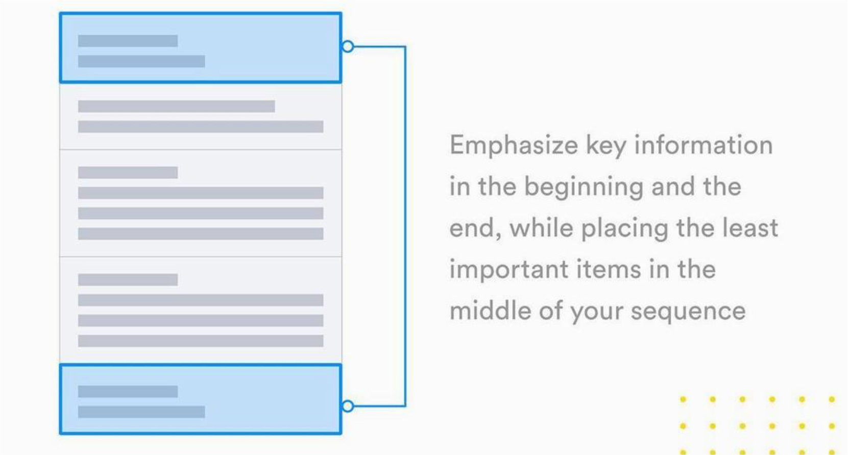
Like a speech — people remember your opening and your closing, rarely the middle details.
#3 — Language in UX Design
- Make language objective and obvious — never assume technical vocabulary
- Examples of good language choices:
- ❌ "expiring soon" → ✅ "expiring in an hour"
- ❌ "authentication" → ✅ "login"
- ❌ "funds" → ✅ "money"
- Sounds and symbols are also language — follow your users' conventions for icons
- Don't design a clever icon that only your team understands
Clear language is invisible — users don't notice it. Confusing language is all they notice.
#4 — Reasoning in UX Design
- Reasoning = drawing conclusions based on knowledge and experience to solve problems and make decisions
- Users bring their existing mental models to your product — don't force them to relearn from scratch
- Example: Search bars
- Conventionally placed at upper-right corner
- Activated by a click
- Users expect to start search by pressing Enter
- Changing any of these without reason creates friction
Innovation is great — but new patterns must connect to users' existing background and expectations.
#5 — Problem-Solving in UX Design
-
Problem-solving = developing strategies to reach goals within a problem space
-
A problem space has three states:
- Initial State — where the user starts
- Intermediate State — the path/journey
- Goal State — what the user wants to achieve
-
Design goal: Make your app the preferred initial state and ensure the intermediate phase goes smoothly
Like a GPS: your job is to give the user a clear route from where they are to where they want to go, without dead ends.
#6 — Decision-Making: Hick's Law
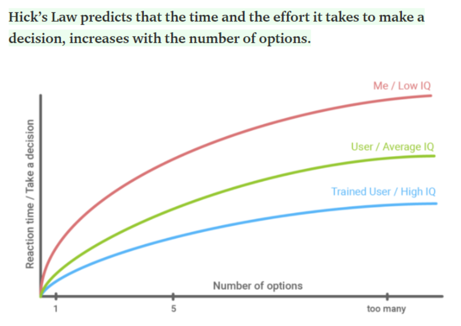
Where:
- = reaction time / time to make a decision
- = empirically derived constant
- = number of equally probable choices
Key insight: The more options, the longer it takes to decide.
- Reduce the number of perceived options on screen → more user-friendly
- Appropriate number: 3–5 options
- Works well for simple options, not for complex decisions
- ⚠️ Don't oversimplify — too many small steps causes users to drop off before reaching the goal
Like a restaurant menu: a 5-item menu is easy to decide from; a 200-item menu causes decision paralysis.
Color Psychology in UX/UI Design
Color Preference by Gender
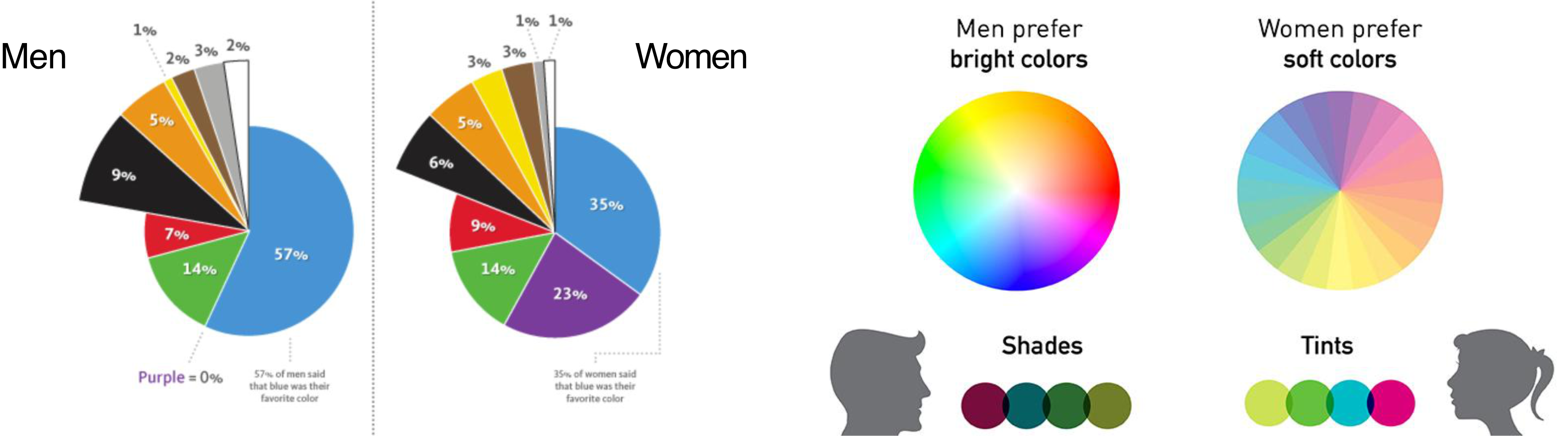
- Men tend to prefer bright colors / shades (darker versions)
- Women tend to prefer soft colors / tints (lighter versions)
- Both genders' #1 favorite color: Blue (57% men, 35% women)
Color Associations in Branding
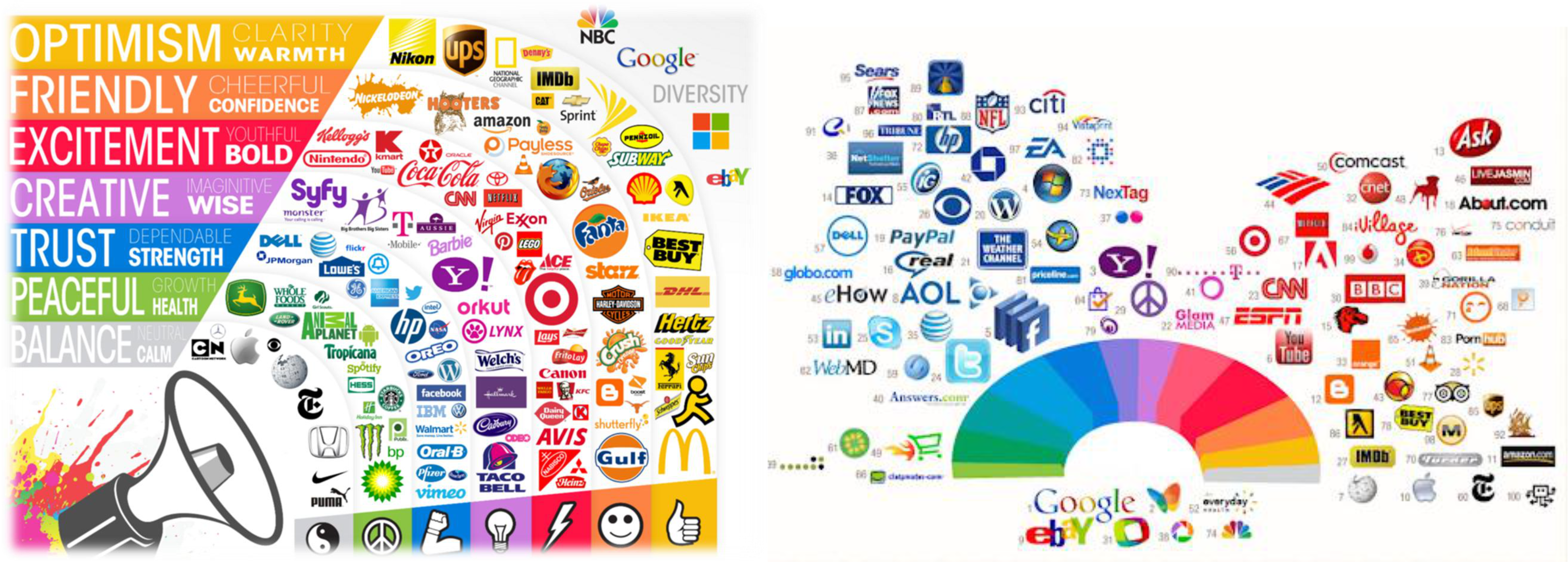
| Color | Associations | Example Brands |
|---|---|---|
| Yellow | Optimism, clarity, warmth | McDonald's, IKEA, Nikon |
| Orange | Friendly, cheerful, confidence | Amazon, Harley-Davidson |
| Red | Excitement, bold, youthful | Coca-Cola, YouTube, Netflix |
| Purple | Creative, wise, imaginative | Cadbury, Hallmark |
| Blue | Trust, dependable, strength | Dell, PayPal, LinkedIn |
| Green | Peaceful, health, growth | Whole Foods, Starbucks |
| Black/White | Balance, calm | Apple, Nike |
Colors communicate before words do. Choosing the wrong color palette can undermine your brand's message entirely.
Wireframe
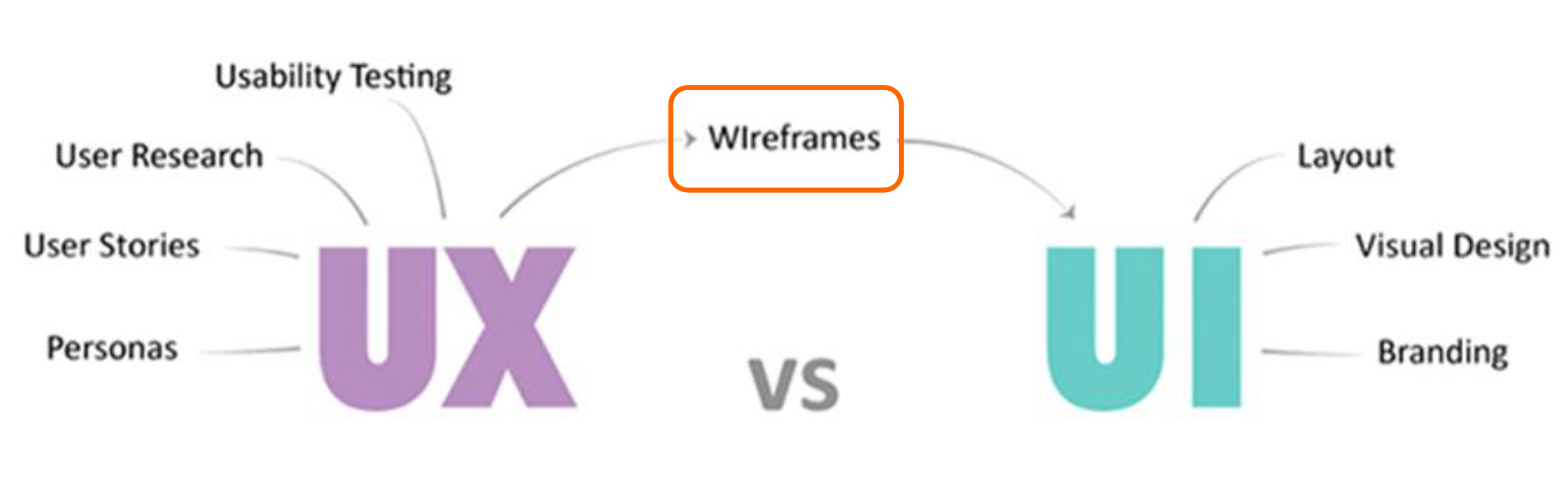
What is a Wireframe?
- A visual outline for UX design
- Clearly lays out content, functions, and connections between pages (screens)
- Does not include color or visual aesthetics — represents the bare bones of the design
- Shows:
- Page layout — how elements are arranged
- Information priority — what's most important
- A bridge between ideas and prototype
A wireframe is like an architect's floor plan — no wallpaper or furniture, just walls, doors, and rooms.
Wireframe vs. Mockup
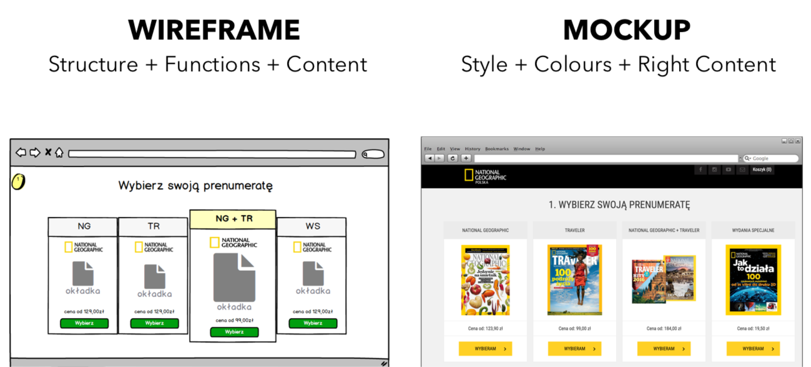
| Wireframe | Mockup (Prototype) | |
|---|---|---|
| Contains | Structure + Functions + Content | Style + Colours + Right Content |
| Fidelity | Low-fidelity | High-fidelity |
| Purpose | Layout and navigation | Visual design validation |
Wireframing Technique (5 Steps)
- Make sure you know what you're building — define the scope and goals clearly
- Focus on UX — think about user flows and needs, not aesthetics
- Find inspiration in existing design sources — research competitors and patterns
- Build your wireframe — sketch or use a tool
- Make it work! — add interactivity and test
Start with Structure & Navigation
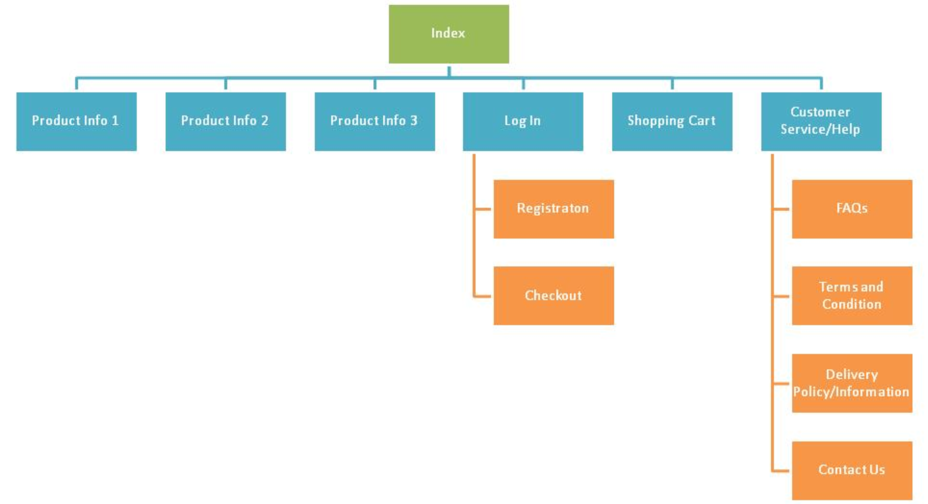
- Before sketching screens, map out the site/app hierarchy
- Example e-commerce hierarchy:
- Index
- Product Info 1 / 2 / 3
- Log In → Registration, Checkout
- Shopping Cart
- Customer Service/Help → FAQs, Terms & Condition, Delivery Policy, Contact Us
- Index
Think of it like organizing a physical store — you need to plan the aisles before stocking the shelves.
Wireframing Tools
| Tool | Notes |
|---|---|
| Balsamiq (balsamiq.com/wireframes/cloud/) | Low-fidelity wireframing, 30-day free trial |
| Justinmind (justinmind.com) | Wireframes to interactive prototypes, 14-day free trial, Mac & Windows |
| Pencil Project (pencil.evolus.vn) | Free & open-source GUI prototyping tool, all platforms |
| Uizard (app.uizard.io) | AI-assisted, supports uploading hand-drawn wireframes |
| Figma | Industry-standard, free tier available |
Summary
UX Design is NOT:          UX Design IS:
─────────────────────────────────────────────
UI design              →   The whole system
A step in process      →   The entire process
About technology       →   About behavior
About usability        →   About value
About the user         →   About context & business
One department         →   Organizational culture
One discipline         →   A collaboration
A choice               →   A means of survival
Good UX doesn't happen by accident. It's the result of strategy, research, and testing — always centered on understanding real users and real goals.